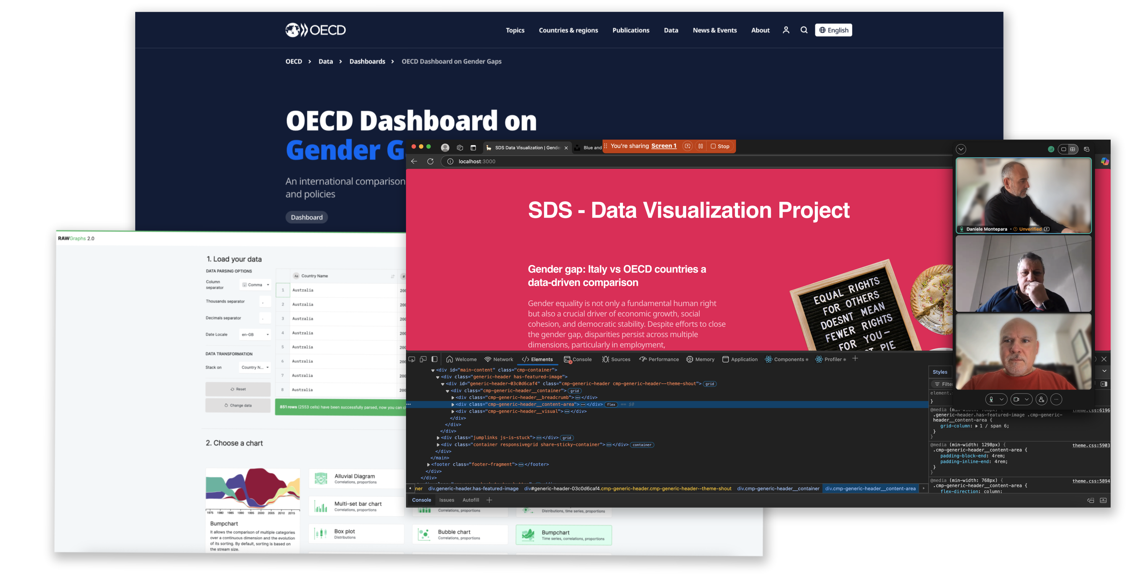
The choice of Gender Gap as a central theme in a Data Visualization
Project is
driven by its societal relevance and the potential for impactful storytelling
through data. Gender disparities exist across multiple domains, including wages,
employment opportunities, education, leadership representation, and access to
technology. By visualizing these gaps, we can reveal trends, highlight progress, and
identify persistent inequalities in a compelling and digestible way.
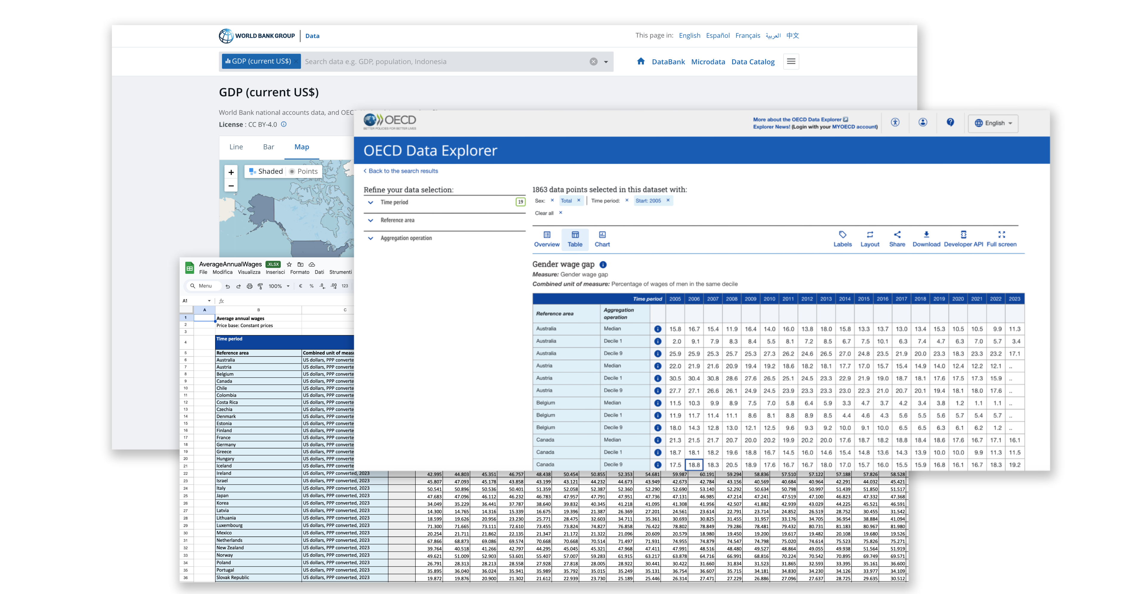
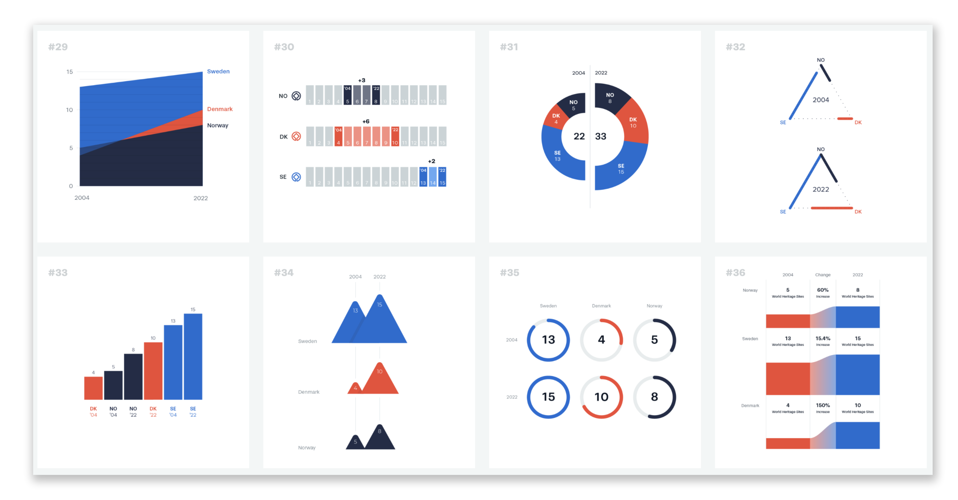
In our brainstorming session, we focused on three key aspects: the choice of data, the type of data representation, and the development of storytelling. We carefully selected relevant datasets to ensure meaningful insights, discussed the most effective visualization techniques to enhance clarity and impact, and structured the storytelling to guide the audience through a compelling narrative. Our approach aimed to balance data accuracy, visual engagement, and narrative flow, ensuring that the final presentation effectively communicated the key messages and findings.
Data-driven storytelling allows us to move beyond abstract statistics, making the issue more tangible and relatable. It also fosters informed discussions and policy-making by providing clear, evidence-based insights. Whether examining wage differences, STEM participation rates, or leadership representation, visualizing gender disparities empowers audiences to understand the challenges and advocate for change.